[feature/corporate-design] Corporate Color + UI Refinements #870
Conversation
This file contains hidden or bidirectional Unicode text that may be interpreted or compiled differently than what appears below. To review, open the file in an editor that reveals hidden Unicode characters.
Learn more about bidirectional Unicode characters
- changed some UI colors in light, contrast and dark UI
- fixed alignment of more button in navigation bar and select button in sort bar with item cell more button
- right aligned sort direction in sort method table view
…below the chevron
felix-schwarz
approved these changes
Jan 14, 2021
Contributor
|
About the fixes done here:
👍
is it moved to the right, right?
👍
👍 |
Contributor
|
Some colors changed. Changes after appyling new themes or anything is missing? here are the changes:
|
Collaborator
Author
|
@jesmrec all your findings are fixed! |
# Please enter a commit message to explain why this merge is necessary,
# especially if it merges an updated upstream into a topic branch.
#
# Lines starting with '#' will be ignored, and an empty message aborts
# the commit.
Contributor
|
Everything fixed Approved |
jesmrec
approved these changes
Jan 18, 2021
# Conflicts:
#	ios-sdk
#	ownCloudAppShared/Client/User Interface/SortBar.swift
Closed
Sign up for free
to join this conversation on GitHub.
Already have an account?
Sign in to comment
Add this suggestion to a batch that can be applied as a single commit.
This suggestion is invalid because no changes were made to the code.
Suggestions cannot be applied while the pull request is closed.
Suggestions cannot be applied while viewing a subset of changes.
Only one suggestion per line can be applied in a batch.
Add this suggestion to a batch that can be applied as a single commit.
Applying suggestions on deleted lines is not supported.
You must change the existing code in this line in order to create a valid suggestion.
Outdated suggestions cannot be applied.
This suggestion has been applied or marked resolved.
Suggestions cannot be applied from pending reviews.
Suggestions cannot be applied on multi-line comments.
Suggestions cannot be applied while the pull request is queued to merge.
Suggestion cannot be applied right now. Please check back later.
Description
The corporate color of the UI themes was updated and furthermore some colors was adopted for a better contrast.
Furthermore the following images was updated with the new corporate color values:
This PR includes also some UI Refinements:
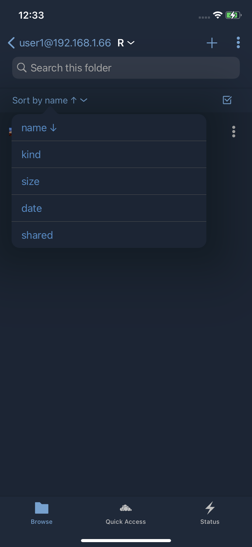
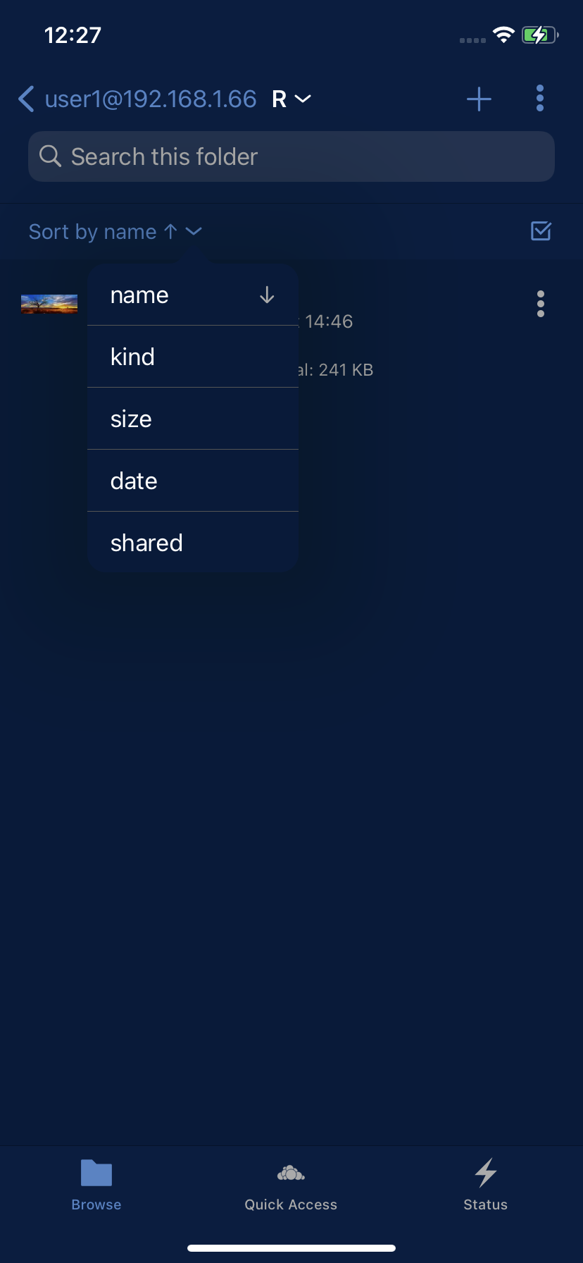
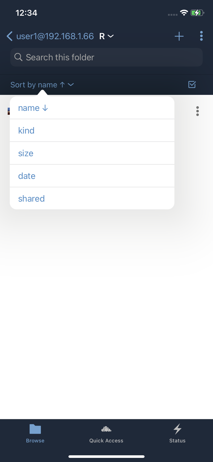
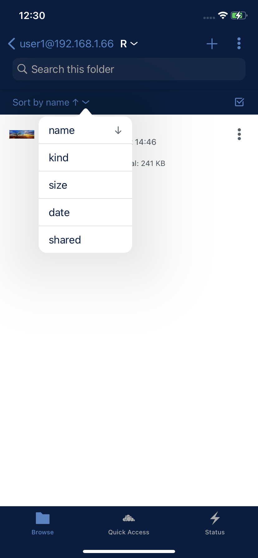
Morebutton in the navigation bar and theSelectbutton in sort bar with the position of theMorebutton in the item cellSort Popoversome pixels to the left to prevent to see some pixels from item cell icons in the backgroundSort Direction ArrowinSort Popoverto the rightRelated Issue
#860
Motivation and Context
Update UI to the correct corporate color and refine UI design
How Has This Been Tested?
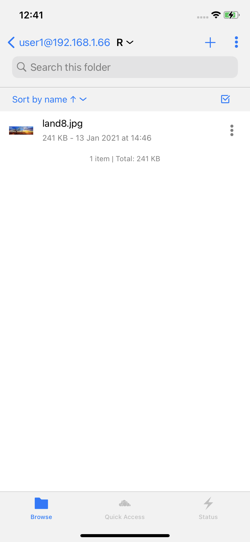
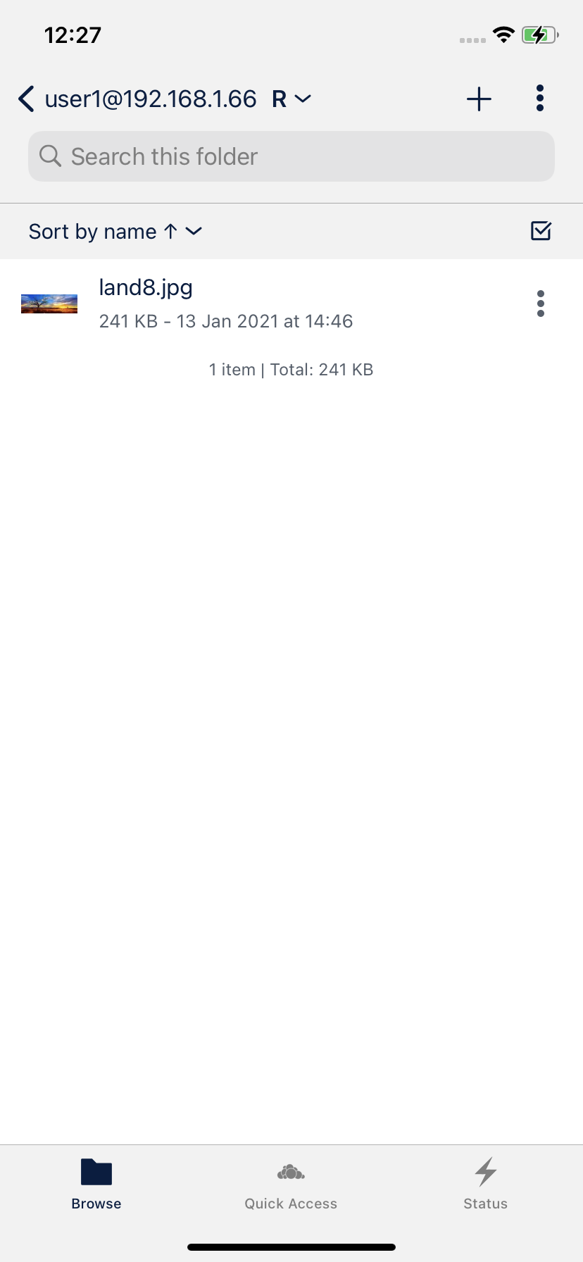
Screenshots (if appropriate):
Types of changes
Checklist: